
react-device-detect - an interesting tool 🕹 to easily identify which device your user access the page from.
Works perfectly in React and can really simplify your code👍.
👌The easiest way is to wrap your JSX components in '<BrowserView> ... <BrowserView/> and that will be only shown on a desktop.
For a bit more real cases, where the same components will need to appear on both: mobile and desktop, but have to be different somehow - you can easily work with ternary operator like:
The
Have a look!
Works perfectly in React and can really simplify your code👍.
👌The easiest way is to wrap your JSX components in '<BrowserView> ... <BrowserView/> and that will be only shown on a desktop.
For a bit more real cases, where the same components will need to appear on both: mobile and desktop, but have to be different somehow - you can easily work with ternary operator like:
 {isBrowser
? <YourBrowserComponent/>
: <YourMobileComponent/> }
The
isBrowser will return true if the user access your page from the desktop. Have a look!
This media is not supported in your browser
VIEW IN TELEGRAM
How can something so cool and beautiful be so useless in UX practices?😔
I like thinking on useful design patterns/decisions that can simplify your user's life by making small changes.
Have a look at progressive hover effects that I posted before.
Here is another pattern I found that made me think '🤔hm, that make sense'.
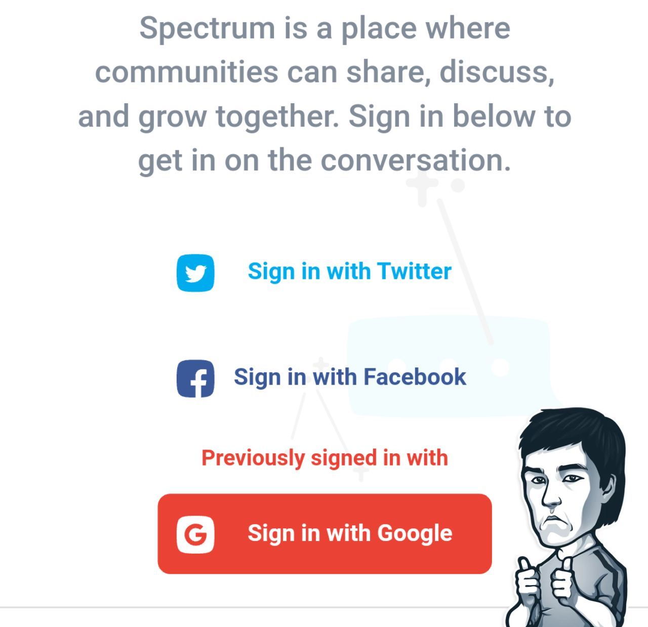
💡'Previous sign in help' on spectrum.chat website.
☝️First of all, they don't even give you a rudimentary option to sign in with an email and password. Seriously, typing in your email, waiting for a confirm link in your inbox or simply looking through all that spam is ridiculous.
You are more than likely to use google, fb, twitter, github, Instagram or even telegram and having those as a signup options are more than sensible.
💎Another thing, is that they remember which one you previously used. So if you signed in with google and then after a while logged out - it will remind you your previous option.
That makes total sense as I might think 'Damn, which one I used last time google or fb?'.
Cool that some people implement such things and constantly try to make our lives easier as ⏳ time is everything!
PS it does use cookies though. So another +1 in cookies vs sessions debate.
Feel free to share with @masant1 any interesting design patterns you found amusing.
Have a look at progressive hover effects that I posted before.
Here is another pattern I found that made me think '🤔hm, that make sense'.
💡'Previous sign in help' on spectrum.chat website.
☝️First of all, they don't even give you a rudimentary option to sign in with an email and password. Seriously, typing in your email, waiting for a confirm link in your inbox or simply looking through all that spam is ridiculous.
You are more than likely to use google, fb, twitter, github, Instagram or even telegram and having those as a signup options are more than sensible.
💎Another thing, is that they remember which one you previously used. So if you signed in with google and then after a while logged out - it will remind you your previous option.
That makes total sense as I might think 'Damn, which one I used last time google or fb?'.
Cool that some people implement such things and constantly try to make our lives easier as ⏳ time is everything!
PS it does use cookies though. So another +1 in cookies vs sessions debate.
Feel free to share with @masant1 any interesting design patterns you found amusing.
Some of you might have seen a post on how to create the best design.
Found another great illustrative examples for you and mistakes to avoid in 🖥 webpage design and ✏️ article design (that relates practically to everyone who ever used Word).
Definitely have a look at the article, at least scroll through pictures to get the main idea as I still see those mistakes very often.
Common webpage design mistakes
Below will 📌 include a selection of the main ones for your convenience.
Found another great illustrative examples for you and mistakes to avoid in 🖥 webpage design and ✏️ article design (that relates practically to everyone who ever used Word).
Definitely have a look at the article, at least scroll through pictures to get the main idea as I still see those mistakes very often.
Common webpage design mistakes
Below will 📌 include a selection of the main ones for your convenience.
🚫How to avoid main mistakes:
🔹 Break down content in logical parts (e.g. increase padding to make it more visual or increase coloured blocks)
🔹 Avoid low contrast image with the text (increase contrast for better readability)
🔹 Don't throw in too many design and typographic styles (normally 3 is enough and looks neat)
🔹 Try to avoid too much text in narrow columns (it looks like you can't make your mind, be precise)
🔹 Your text on a pic background shouldn't overlap important parts (e.g. faces, find a monotone area on the pic for the text)
🔹 Work with hierarchy (titles should be bolder or bigger than normal text, but don't overdo it and don't make your titles too long)
🔹 Your navbar needs to be neat and create a 'freedom feeling', don't throw in emails, phone numbers or anything else that can be put in a footer
✊ Hope it helps you to create better designs (or get constructive arguments to use with your designers)
🔹 Break down content in logical parts (e.g. increase padding to make it more visual or increase coloured blocks)
🔹 Avoid low contrast image with the text (increase contrast for better readability)
🔹 Don't throw in too many design and typographic styles (normally 3 is enough and looks neat)
🔹 Try to avoid too much text in narrow columns (it looks like you can't make your mind, be precise)
🔹 Your text on a pic background shouldn't overlap important parts (e.g. faces, find a monotone area on the pic for the text)
🔹 Work with hierarchy (titles should be bolder or bigger than normal text, but don't overdo it and don't make your titles too long)
🔹 Your navbar needs to be neat and create a 'freedom feeling', don't throw in emails, phone numbers or anything else that can be put in a footer
✊ Hope it helps you to create better designs (or get constructive arguments to use with your designers)
💳 Card Component
Bootstrap, Material UI, Bulma - all have default card components.
You have seen those pretty much everywhere all over the web 🖥.
Slack, GitHub, Stripe, Webflow, Atlassian all use it heavily and have their personal card looks.
Sometimes the shadow ☁️ and corners are different, sometimes the stripe 💈at the top/side/bottom.
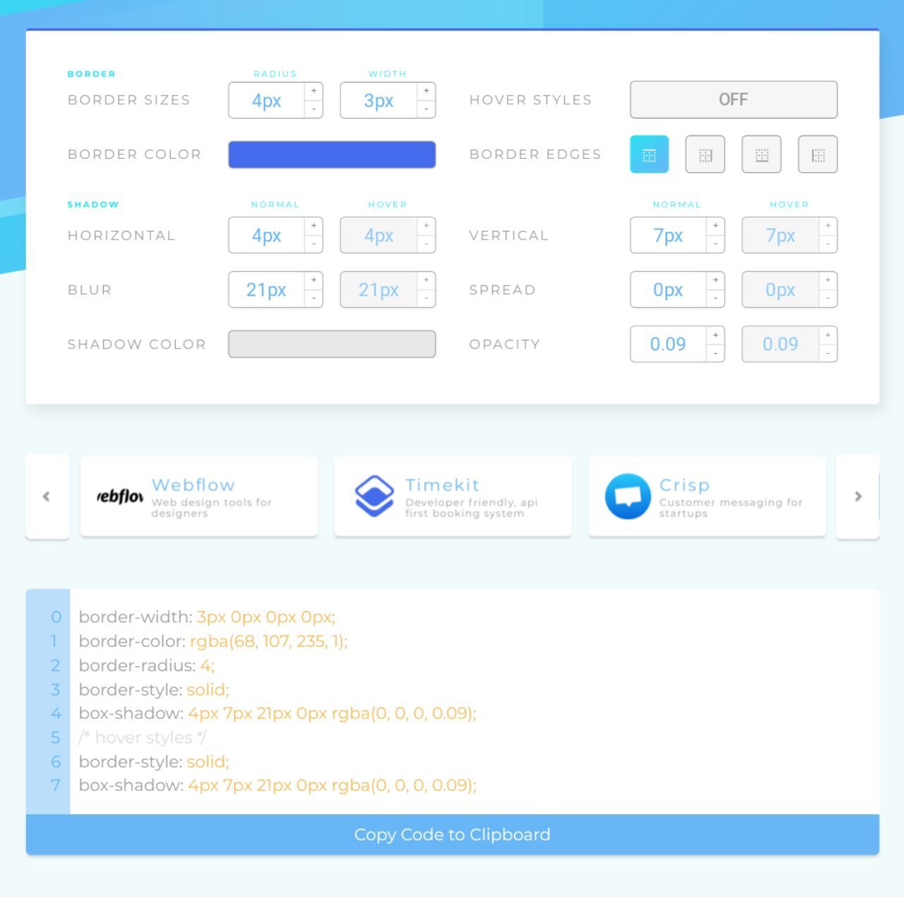
It is really the question of preference and to make it easier, there is an awesome tool called card.surge.sh 🔥
It allows you to nicely customise the card and provides the code snippet.
For lazy people like myself there is a selection of different styles from Slack, Webflow etc
Have a glance 👓
Bootstrap, Material UI, Bulma - all have default card components.
You have seen those pretty much everywhere all over the web 🖥.
Slack, GitHub, Stripe, Webflow, Atlassian all use it heavily and have their personal card looks.
Sometimes the shadow ☁️ and corners are different, sometimes the stripe 💈at the top/side/bottom.
It is really the question of preference and to make it easier, there is an awesome tool called card.surge.sh 🔥
It allows you to nicely customise the card and provides the code snippet.
For lazy people like myself there is a selection of different styles from Slack, Webflow etc
Have a glance 👓
Some of you have asked for the code snippet of this
While I don't see any good reason to implement this apart from pranking your users or learning, I will try to replicate it.
If someone wants to see it vote for 🤝
If you want to replicate this yourself, give me a shout, we will test it together and share here 👍
While I don't see any good reason to implement this apart from pranking your users or learning, I will try to replicate it.
If someone wants to see it vote for 🤝
If you want to replicate this yourself, give me a shout, we will test it together and share here 👍
Telegram
TheFrontEnd🔥
Cool way to annoy people🤷♂
This media is not supported in your browser
VIEW IN TELEGRAM
Drag and Drop animation🔥
I have recently questioned myself on best ways to implement drag and drop functionalities.
Many clients are seeing it as a 5min deal or 'just make it moveable'.
Sounds so simple, isn't it?🤷♂
Decided to share a few resources I found along the way.
Since I currently work with React, the below resources are mostly linked to it. However, I am also sharing JS and HTML5 ways.
🦇React-dragula - an official react wrapper for React. The simpliest solution so far. Dragular - is the same thing for those who wants to stay independent of React.
React-beautiful-dnd - a more customisable approach, which has better animation, works with mobile and horizontal DnD. As a compromise, it is a bit harder to implement, but the guys did an awesome free video tutorial that even includes React set up. Plus have a look at their examples
If you the person who needs max flexibility, don't look any further React-dnd is probably the most customisable out of all.
And finally, for the oldschool people here HTML5 version its deadly customisable, but as you can guess you will have to spent some time writing it from scratch.
Now you can have your own Trello board and show off to your friends😉.
💭 'lets use my own Trello board'
Many clients are seeing it as a 5min deal or 'just make it moveable'.
Sounds so simple, isn't it?🤷♂
Decided to share a few resources I found along the way.
Since I currently work with React, the below resources are mostly linked to it. However, I am also sharing JS and HTML5 ways.
🦇React-dragula - an official react wrapper for React. The simpliest solution so far. Dragular - is the same thing for those who wants to stay independent of React.
React-beautiful-dnd - a more customisable approach, which has better animation, works with mobile and horizontal DnD. As a compromise, it is a bit harder to implement, but the guys did an awesome free video tutorial that even includes React set up. Plus have a look at their examples
If you the person who needs max flexibility, don't look any further React-dnd is probably the most customisable out of all.
And finally, for the oldschool people here HTML5 version its deadly customisable, but as you can guess you will have to spent some time writing it from scratch.
Now you can have your own Trello board and show off to your friends😉.
💭 'lets use my own Trello board'
GitHub
GitHub - bevacqua/react-dragula: :ok_hand: Drag and drop so simple it hurts
:ok_hand: Drag and drop so simple it hurts. Contribute to bevacqua/react-dragula development by creating an account on GitHub.

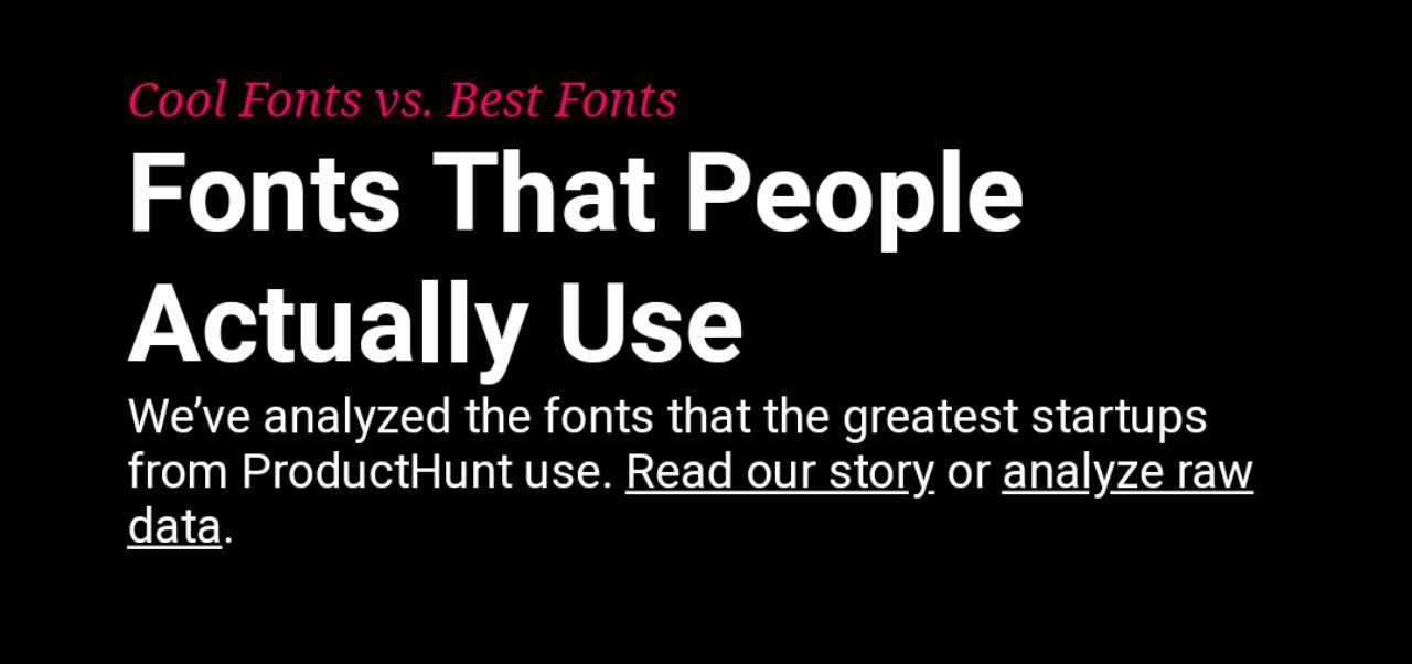
If you somehow missed it from other sources, here is a great tool to end up 'which font to use' discussion.
Fonts that most successful start ups are using icons8.com
Fonts that most successful start ups are using icons8.com
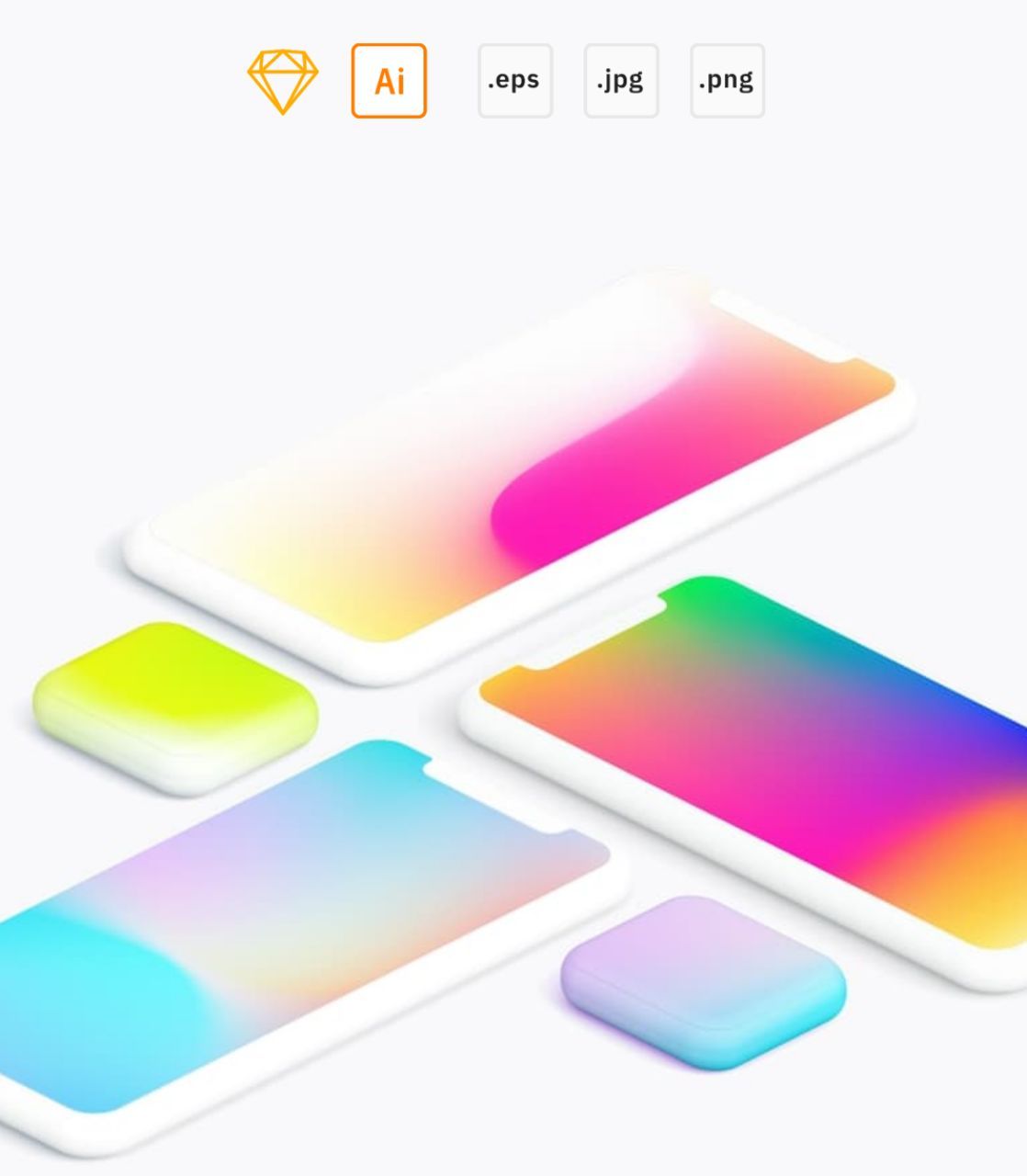
Collection of mash gradients in every adequate format. Enjoy 🔥
The guy is a UX guru and has lots of stuff (but not always for free🤷♂)
The guy is a UX guru and has lots of stuff (but not always for free🤷♂)
A very thorough, well written comparison of building the same thing in React and Vue.
If you wondered how different are those two, have a quick read.
👓 Read time: 13 min
⚡Instant read
If you wondered how different are those two, have a quick read.
👓 Read time: 13 min
⚡Instant read
Medium
I created the exact same app in React and Vue. Here are the differences.
React vs Vue. Finally, a side-by-side code comparison between Vue and React! 🎉
This media is not supported in your browser
VIEW IN TELEGRAM
Lazyload.js - JS library that loads images ☝️ only when they are in the viewport and remain there.
Only 350 bytes 🎈
Only 350 bytes 🎈
Google Instant Apps
Its been a while now since Google released its new approach to launch apps without downloading it ⚡.
Has it been extremely popular for the past 2 years? Well, not really🤷♂. I haven't seen it being used too heavily yet.
While it is a faster alternative than the standard app, some people might not have a 'lighter version' of the app for Google to catch it.
It did allow AR no so long time ago to be launched through the instant app, which is pretty cool though👍.
But I do have questions regarding speed when it comes to PWA and Instant Apps. If you want to see such comparison and see where Instant Apps can actually benefit, vote below.
Its been a while now since Google released its new approach to launch apps without downloading it ⚡.
Has it been extremely popular for the past 2 years? Well, not really🤷♂. I haven't seen it being used too heavily yet.
While it is a faster alternative than the standard app, some people might not have a 'lighter version' of the app for Google to catch it.
It did allow AR no so long time ago to be launched through the instant app, which is pretty cool though👍.
But I do have questions regarding speed when it comes to PWA and Instant Apps. If you want to see such comparison and see where Instant Apps can actually benefit, vote below.
Instagram problems
#complain #dislike #thoughts
There is a huge problem that I see with Instagram. While it does an acceptable job with UI its UX is massively damaged.
Its supposed to be a platform where everyone can share photos (well, now videos and stories as well). The sharing mechanism by definition means that I can (try to guess) - share content with friends/people.
However, if a channel posts something nice and I try to share it, its vert likely that the person I shared it with won't see it right away.
Yes, if the group is private they will have to:
1. Click on the post
2. Follow the group
3. Wait till they get accepted
4. Revisit the post
Seriously?😳
4 steps to view shared post? Tell me about terrible UX.
Think of telegram as an alternative. Imagine there is a channel only with photos. I can easily share it in 1 click and the user will see it straight away.
☝️But where there is a problem - there is always an opportunity.
The next person who creates a bot or a service that allows easy sharing from private groups - will nicely disrupt instagram and might make a good bunch of 💰 (Instagram might even buy it, who knows)
What do you think?
🤮 They could do a better job
❤️ Instagram forever
#complain #dislike #thoughts
There is a huge problem that I see with Instagram. While it does an acceptable job with UI its UX is massively damaged.
Its supposed to be a platform where everyone can share photos (well, now videos and stories as well). The sharing mechanism by definition means that I can (try to guess) - share content with friends/people.
However, if a channel posts something nice and I try to share it, its vert likely that the person I shared it with won't see it right away.
Yes, if the group is private they will have to:
1. Click on the post
2. Follow the group
3. Wait till they get accepted
4. Revisit the post
Seriously?😳
4 steps to view shared post? Tell me about terrible UX.
Think of telegram as an alternative. Imagine there is a channel only with photos. I can easily share it in 1 click and the user will see it straight away.
☝️But where there is a problem - there is always an opportunity.
The next person who creates a bot or a service that allows easy sharing from private groups - will nicely disrupt instagram and might make a good bunch of 💰 (Instagram might even buy it, who knows)
What do you think?
🤮 They could do a better job
❤️ Instagram forever