The story how one JS line can slow down ft.com in 10 times and why you should be careful with JSON.parse/stringify
#bestpractice
http://bit.do/eudSR
#bestpractice
http://bit.do/eudSR
This media is not supported in your browser
VIEW IN TELEGRAM
🤔Do you prefer medium articles as telegram instant view or links?
Personally I like how telegram saves articles and I can read them in groups when I am flying or have no internet connection.
Personally I like how telegram saves articles and I can read them in groups when I am flying or have no internet connection.
As a happy Pixel user, I cannot avoid posting the Pixel 3 leak from one of the Russian tech channel.
It has been 1.5 years now and unlike my previous Samsung S6 Edge it had absolutely no lags, everything went nice and smooth.
I had to replace battery eventually, which cost me 50$ and 1hr waiting. But now it hold the battery for a full with intensive usage.
On a side note, seems that Google decided not to reinvent the wheel and copy iPhone X design (regardless trying to be authentic). The wired earbuds do look wierd to me though.
It has been 1.5 years now and unlike my previous Samsung S6 Edge it had absolutely no lags, everything went nice and smooth.
I had to replace battery eventually, which cost me 50$ and 1hr waiting. But now it hold the battery for a full with intensive usage.
On a side note, seems that Google decided not to reinvent the wheel and copy iPhone X design (regardless trying to be authentic). The wired earbuds do look wierd to me though.
For all jQuery fans. Github has recently removed it from its frontend. So did Bootstrap some time ago. Have a look at the article - it explains why this happens.
The long story short - with HTML 5 and CSS possibilities, especially in combination with JS, the benefits that jQuery used to bring us are slowly, but steadily decreasing. Turned out, if you are still using (or suggesting) to use jQuery, some devs would treat you as a not-so-good developer.
However, we all know that time saving is a big thing and if you feel too comfortable with jQuery and want to use it to build something really quickly - you can still add it.
❔The question is simple though - is it worth doing it if in 5 years it will be barely used?
The long story short - with HTML 5 and CSS possibilities, especially in combination with JS, the benefits that jQuery used to bring us are slowly, but steadily decreasing. Turned out, if you are still using (or suggesting) to use jQuery, some devs would treat you as a not-so-good developer.
However, we all know that time saving is a big thing and if you feel too comfortable with jQuery and want to use it to build something really quickly - you can still add it.
❔The question is simple though - is it worth doing it if in 5 years it will be barely used?
This media is not supported in your browser
VIEW IN TELEGRAM
☝️Is anyone interested in a template on how to calculate your app's cost?
It can benefit those who are planning to do freelance work and those who can't code and want to see how much 💰 they need.
It can benefit those who are planning to do freelance work and those who can't code and want to see how much 💰 they need.
While I am preparing an app's calculation template for you, have a look at this one.
Bloomer - React's 🍐Bulma framework
https://bloomer.js.org/#/
To see how the end project might look you can have at Kanban board built with Bulma (just an example)
https://dansup.github.io/bulma-templates/templates/kanban.html
It has its own grid, which practically can be similar to Bootstrap
PS that is the one we are using for our project with the team. More updates will come soon.
Bloomer - React's 🍐Bulma framework
https://bloomer.js.org/#/
To see how the end project might look you can have at Kanban board built with Bulma (just an example)
https://dansup.github.io/bulma-templates/templates/kanban.html
It has its own grid, which practically can be similar to Bootstrap
PS that is the one we are using for our project with the team. More updates will come soon.
Bloomer — A set of React Stateless Components
https://bloomer.js.org
⚪️🔵Framer X - is a new design tool that is currently in beta.
It can help in creation of responsive, animated designs..
Haven't tried yet, but their videos look sleek.
https://framer.com/x/
It can help in creation of responsive, animated designs..
Haven't tried yet, but their videos look sleek.
https://framer.com/x/
react-device-detect - an interesting tool 🕹 to easily identify which device your user access the page from.
Works perfectly in React and can really simplify your code👍.
👌The easiest way is to wrap your JSX components in '<BrowserView> ... <BrowserView/> and that will be only shown on a desktop.
For a bit more real cases, where the same components will need to appear on both: mobile and desktop, but have to be different somehow - you can easily work with ternary operator like:
The
Have a look!
Works perfectly in React and can really simplify your code👍.
👌The easiest way is to wrap your JSX components in '<BrowserView> ... <BrowserView/> and that will be only shown on a desktop.
For a bit more real cases, where the same components will need to appear on both: mobile and desktop, but have to be different somehow - you can easily work with ternary operator like:
 {isBrowser
? <YourBrowserComponent/>
: <YourMobileComponent/> }
The
isBrowser will return true if the user access your page from the desktop. Have a look!
This media is not supported in your browser
VIEW IN TELEGRAM
How can something so cool and beautiful be so useless in UX practices?😔
I like thinking on useful design patterns/decisions that can simplify your user's life by making small changes.
Have a look at progressive hover effects that I posted before.
Here is another pattern I found that made me think '🤔hm, that make sense'.
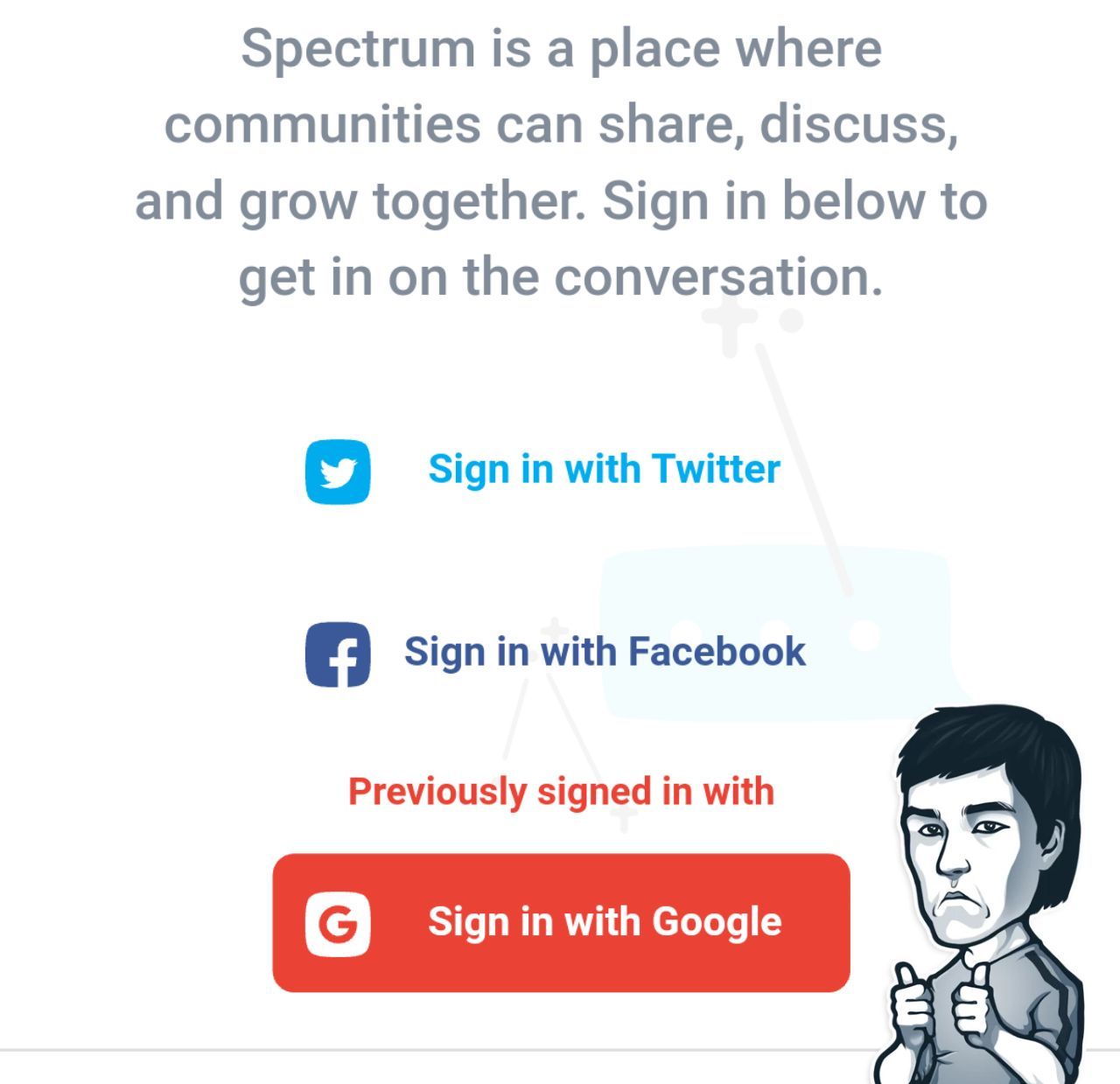
💡'Previous sign in help' on spectrum.chat website.
☝️First of all, they don't even give you a rudimentary option to sign in with an email and password. Seriously, typing in your email, waiting for a confirm link in your inbox or simply looking through all that spam is ridiculous.
You are more than likely to use google, fb, twitter, github, Instagram or even telegram and having those as a signup options are more than sensible.
💎Another thing, is that they remember which one you previously used. So if you signed in with google and then after a while logged out - it will remind you your previous option.
That makes total sense as I might think 'Damn, which one I used last time google or fb?'.
Cool that some people implement such things and constantly try to make our lives easier as ⏳ time is everything!
PS it does use cookies though. So another +1 in cookies vs sessions debate.
Feel free to share with @masant1 any interesting design patterns you found amusing.
Have a look at progressive hover effects that I posted before.
Here is another pattern I found that made me think '🤔hm, that make sense'.
💡'Previous sign in help' on spectrum.chat website.
☝️First of all, they don't even give you a rudimentary option to sign in with an email and password. Seriously, typing in your email, waiting for a confirm link in your inbox or simply looking through all that spam is ridiculous.
You are more than likely to use google, fb, twitter, github, Instagram or even telegram and having those as a signup options are more than sensible.
💎Another thing, is that they remember which one you previously used. So if you signed in with google and then after a while logged out - it will remind you your previous option.
That makes total sense as I might think 'Damn, which one I used last time google or fb?'.
Cool that some people implement such things and constantly try to make our lives easier as ⏳ time is everything!
PS it does use cookies though. So another +1 in cookies vs sessions debate.
Feel free to share with @masant1 any interesting design patterns you found amusing.
Some of you might have seen a post on how to create the best design.
Found another great illustrative examples for you and mistakes to avoid in 🖥 webpage design and ✏️ article design (that relates practically to everyone who ever used Word).
Definitely have a look at the article, at least scroll through pictures to get the main idea as I still see those mistakes very often.
Common webpage design mistakes
Below will 📌 include a selection of the main ones for your convenience.
Found another great illustrative examples for you and mistakes to avoid in 🖥 webpage design and ✏️ article design (that relates practically to everyone who ever used Word).
Definitely have a look at the article, at least scroll through pictures to get the main idea as I still see those mistakes very often.
Common webpage design mistakes
Below will 📌 include a selection of the main ones for your convenience.
🚫How to avoid main mistakes:
🔹 Break down content in logical parts (e.g. increase padding to make it more visual or increase coloured blocks)
🔹 Avoid low contrast image with the text (increase contrast for better readability)
🔹 Don't throw in too many design and typographic styles (normally 3 is enough and looks neat)
🔹 Try to avoid too much text in narrow columns (it looks like you can't make your mind, be precise)
🔹 Your text on a pic background shouldn't overlap important parts (e.g. faces, find a monotone area on the pic for the text)
🔹 Work with hierarchy (titles should be bolder or bigger than normal text, but don't overdo it and don't make your titles too long)
🔹 Your navbar needs to be neat and create a 'freedom feeling', don't throw in emails, phone numbers or anything else that can be put in a footer
✊ Hope it helps you to create better designs (or get constructive arguments to use with your designers)
🔹 Break down content in logical parts (e.g. increase padding to make it more visual or increase coloured blocks)
🔹 Avoid low contrast image with the text (increase contrast for better readability)
🔹 Don't throw in too many design and typographic styles (normally 3 is enough and looks neat)
🔹 Try to avoid too much text in narrow columns (it looks like you can't make your mind, be precise)
🔹 Your text on a pic background shouldn't overlap important parts (e.g. faces, find a monotone area on the pic for the text)
🔹 Work with hierarchy (titles should be bolder or bigger than normal text, but don't overdo it and don't make your titles too long)
🔹 Your navbar needs to be neat and create a 'freedom feeling', don't throw in emails, phone numbers or anything else that can be put in a footer
✊ Hope it helps you to create better designs (or get constructive arguments to use with your designers)
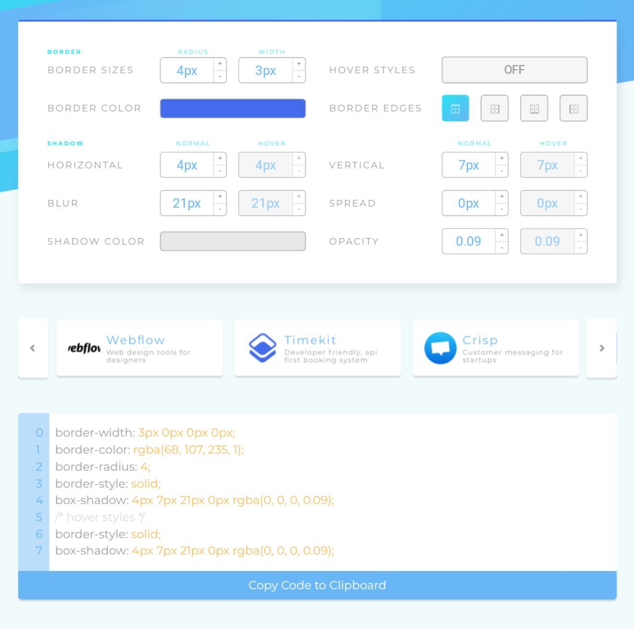
💳 Card Component
Bootstrap, Material UI, Bulma - all have default card components.
You have seen those pretty much everywhere all over the web 🖥.
Slack, GitHub, Stripe, Webflow, Atlassian all use it heavily and have their personal card looks.
Sometimes the shadow ☁️ and corners are different, sometimes the stripe 💈at the top/side/bottom.
It is really the question of preference and to make it easier, there is an awesome tool called card.surge.sh 🔥
It allows you to nicely customise the card and provides the code snippet.
For lazy people like myself there is a selection of different styles from Slack, Webflow etc
Have a glance 👓
Bootstrap, Material UI, Bulma - all have default card components.
You have seen those pretty much everywhere all over the web 🖥.
Slack, GitHub, Stripe, Webflow, Atlassian all use it heavily and have their personal card looks.
Sometimes the shadow ☁️ and corners are different, sometimes the stripe 💈at the top/side/bottom.
It is really the question of preference and to make it easier, there is an awesome tool called card.surge.sh 🔥
It allows you to nicely customise the card and provides the code snippet.
For lazy people like myself there is a selection of different styles from Slack, Webflow etc
Have a glance 👓