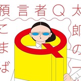
Черным по желтому.
Прием сокращения длины слова за счет масштабирования одной или нескольких букв.
#typography #trick #nytm
Прием сокращения длины слова за счет масштабирования одной или нескольких букв.
#typography #trick #nytm
👍8
❤5
❤🔥2
The Athletic
A2-Type
The Inline typeface is complimented by our Regular Slab Bold typeface, used in their logo also and across the entire brand in all media (by Gretel).
#typeface #custom #identity
A2-Type
The Inline typeface is complimented by our Regular Slab Bold typeface, used in their logo also and across the entire brand in all media (by Gretel).
#typeface #custom #identity
👍2❤🔥1
Alpine New Alps
by Black [Foudry]
In order to design a typeface personifying specifically the new Alpine brand, we settled on a refined, contemporary geometric design, with sharp details bringing a more unique texture. The terminals of the letters' strokes and stems are radical, evoking the chiseled and steep landscape of the Alps mountains. This sharpness is also found in the symbols, giving coherence to the whole glyph set, and bringing a theatrical power to the design. In addition, balancing white space between the letters was at the heart of the design process; the spacing is carefuly adjusted in order to reach purity and gracefulness. Similarly we decided not to have a Bold weight to favour a lighter Semibold weight instead, for a better refinement of the typography. To sum up, Alpine New Alps is available in 3 weights (Light, Regular, SemiBold) in extended Latin that allows the brand to communicate widely to its community, on numerous supports.
#custom #typeface
❤3👍1
Слиться с фоном (приём).
Coles Phillips — один из тех, кто использовал приём в коммерческой иллюстрации в начале ХX века.
👨🎨 ——> www.
#illustration #trick #old_good_things
Coles Phillips — один из тех, кто использовал приём в коммерческой иллюстрации в начале ХX века.
👨🎨 ——> www.
#illustration #trick #old_good_things
👍5🔥4
❤🔥6❤4