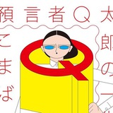
Rapid Typeface
ST Rapid is designed by Laurenz Brunner, first released by Source Type in 2022.
#typeface #typedesign
ST Rapid is designed by Laurenz Brunner, first released by Source Type in 2022.
#typeface #typedesign
❤3
KINFOLK Mag
Schick Toikka
Since 2011, Kinfolk has become a leading lifestyle authority with a dynamic mix of print and online media, including a quarterly magazine sold in over 100 countries in four languages. For their rebranding we created a type family that consists of 6 different styles, a Serif and a Sans counterpart with matching italics. Together the fonts create a compact but versatile palette that serves all the typographic needs of the magazine, from impressive headlines to longer articles.
#typografy #typeface #typedesign #custom #editorial
❤🔥4❤3
2018 England World Cup
Craig Ward
Commissioned by Nike, the type was modeled in 3D to feature the St George's cross and create a dynamic, twisting design which features inline, outline and fill weights along with complementary numerals.
#typography #custom #typeface #typedesign
Craig Ward
Commissioned by Nike, the type was modeled in 3D to feature the St George's cross and create a dynamic, twisting design which features inline, outline and fill weights along with complementary numerals.
#typography #custom #typeface #typedesign
👍2❤1
❤🔥6
Equinox
Craig Ward
Фрагментация буквы по признаку тень/свет из состава изображения буквы в объеме. Прием.
Advertising campaign typography for Equinox through W+K, New York.
#typography #trick
Craig Ward
Фрагментация буквы по признаку тень/свет из состава изображения буквы в объеме. Прием.
Advertising campaign typography for Equinox through W+K, New York.
#typography #trick
👍2
Наивный стиль
Инструмент письма (изолента?), видимо, не позволяет без заморочек получить овал или круг. А посему так — коротким путем.
Можно переносить в цифру такой подход.
#typography #analog #ugly
Инструмент письма (изолента?), видимо, не позволяет без заморочек получить овал или круг. А посему так — коротким путем.
Можно переносить в цифру такой подход.
#typography #analog #ugly
❤🔥3❤3👍2