❤4🔥2
Typeface
by workroom
Довольно логично, на первый взгляд. Пропорции знаков определяются геометрией и желаниями автора получить особую выразительность в наборе.
🎬———>> wwwwwwww
#typedesign #logico #custom #typeface
by workroom
Довольно логично, на первый взгляд. Пропорции знаков определяются геометрией и желаниями автора получить особую выразительность в наборе.
🎬———>> wwwwwwww
#typedesign #logico #custom #typeface
❤🔥2❤2
Fast Company Magazine Logo
by Mike Schnaidt and Rui Abreu
I chose to create a fresh logo using the versatile Grifo type family. I love how it’s thin areas feel sophisticated, yet it’s serifs are daring. I set the logo in Grifito, the more condensed version, and the small cap A and O in the wider Grifo. From there, I asked for some adjustments to harken back to the old Fast Company logo, and the type designer Rui Abreu modified all of the letterforms to be more harmonious.
#logo #editorial
❤2🔥2
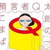
The font’s name is Gorton
Эта картинка — анонс развернутого и богато иллюстрированного рассказа про историю шрифта Гортон. Прекрасное.
#typedesign #wow
Эта картинка — анонс развернутого и богато иллюстрированного рассказа про историю шрифта Гортон. Прекрасное.
#typedesign #wow
❤🔥9❤3
KGNU by order
KGNU (1390 AM & 88.5 FM) is a radio station serving the greater Denver and Boulder areas in Colorado.
LL Supreme Bold and Light, by Lineto→, are used for legibility and clarity in the brand.
Their construction mirrors the geometry of LL Cobra VIP.
LL Cobra VIP, also by Lineto→, is used as the primary identification of the logo, and as a graphic support to the extended brand language.
#typeface #identity
❤5