Wise Custom Typeface
by NaN
Beginning with a redrawn logo, we collaborated with the London-based design agency to craft a modification and extension of Feliciano’s Parafina typeface for the brand – expanding its language support to 361* different scripts across Latin, Cyrillic and Greek, whilst providing countless adjusted currency symbols alongside the basic Latin set.
In addition to the sans serif’s more rigorous, pragmatic functions, we also introduced a finely tuned set of custom alternates, carefully adjusting the regularity of their appearance in words and how they would integrate across a body of text. For this purpose, we developed a clever set of ligatures and contextual alternates, ensuring every letter combination and every word would look just right. The result? An original, proudly contemporary brand outfitted with a meticulous, marvellous custom tilting typeface.
#custom #typeface #identity
👍3🔥1
junge berner künstler
by arnold rüdlinger
this is the catalogue of a 1955 exhibition of young bernese art in the kunsthalle bern. kunsthalle director arnold rüdlinger (1919-1967) wrote the introductory text.
Всё так интересно распределено по полосе.
Разлёт слов и разрядка в цифрах.
#typography #bookcover
by arnold rüdlinger
this is the catalogue of a 1955 exhibition of young bernese art in the kunsthalle bern. kunsthalle director arnold rüdlinger (1919-1967) wrote the introductory text.
Всё так интересно распределено по полосе.
Разлёт слов и разрядка в цифрах.
#typography #bookcover
❤6🔥2
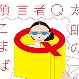
Apex by Gold Front
Шрифт Herbus by Eliott Grunewald (из серии, как говорится, «где-то я такой уже видел, но не помню где»). Подробности презентации графического стиля идентификации.
#custom #typeface #identity #ligatures
Шрифт Herbus by Eliott Grunewald (из серии, как говорится, «где-то я такой уже видел, но не помню где»). Подробности презентации графического стиля идентификации.
#custom #typeface #identity #ligatures
👍4🤔2❤1
👆«Ах, да, вот, где я мог это видеть» — скажет пытливый читатель и будет прав.
Busorama Medium designed by Tom Carnase for ITC: International Typeface Corporation
#old_good_things
Busorama Medium designed by Tom Carnase for ITC: International Typeface Corporation
#old_good_things
🔥5❤3
ANDMORE
by Collins
We redesigned their purpose, offering, company structure and brand around this strategy. From “a holding company of wholesale markets,” we pivoted IMC to be the first “omni-channel wholesale market.” We united their portfolio under a new name: Andmore — a promise of more ease, more access, more options, and more.
#logo #identity #trick
❤🔥3❤2
Catherine Zask
Graphiste, affichiste, artiste, auteur… Catherine Zask est aussi multiple que ses écritures et les matériaux à partir desquels elle développe son langage visuel.
Афиша • 2001
#typography #trick
Graphiste, affichiste, artiste, auteur… Catherine Zask est aussi multiple que ses écritures et les matériaux à partir desquels elle développe son langage visuel.
Афиша • 2001
#typography #trick
❤4🔥1
Lucille Tenazas
California College of Arts and Crafts Adopt-a-Book poster, 1992.
Настроенческое. Милое количество разных шрифтов и шрифточков.
#typography
California College of Arts and Crafts Adopt-a-Book poster, 1992.
Настроенческое. Милое количество разных шрифтов и шрифточков.
#typography
❤5
DAILY THINGS
• founded and curated by
Antoine Harinthe, Mathieu Selvatici
• art direction — Mathieu Selvatici
• design — Paul Gacon
Фотожурнал. Сцены из ежедневной жизни.
#magcover #editorial #typography
• founded and curated by
Antoine Harinthe, Mathieu Selvatici
• art direction — Mathieu Selvatici
• design — Paul Gacon
Фотожурнал. Сцены из ежедневной жизни.
#magcover #editorial #typography
❤1🔥1
Forwarded from oooe
Иллюстрации из трактата "Phantom Flowers: A Treatise on the Art of Producing Skeleton Leaves", рассказывающего об искусстве получения "скелетов" листьев. Издан в Бостоне, 1864 г.
Собранные листья заливались горячей водой и хранились на солнце примерно месяц, после чего подгнившая ткань листа аккуратно удалялась пальцами или мягкой кистью. Затем скелетированные листья отбеливались с помощью раствора хлорида или извести, высушивались и помещались в рамки.
Собранные листья заливались горячей водой и хранились на солнце примерно месяц, после чего подгнившая ткань листа аккуратно удалялась пальцами или мягкой кистью. Затем скелетированные листья отбеливались с помощью раствора хлорида или извести, высушивались и помещались в рамки.
❤7🔥4