Alexander Girard Wooden Doll No. 18 (1963)
The Wooden Dolls, which Girard created for his own home in Santa Fe and made himself, are likewise inspired by his own extensive collection of works of popular art. Half decorative element, half toy, the Wooden Dolls were originally intended only for personal use. Based on originals found in the Girard Estate held by the Vitra Design Museum, the partly joyful, partly grim-looking company of dolls is now coming out as a charming enhancement to any interior.
#old_good_things #graphic #illustration
❤9🔥1
Virna custom font for MTV
by Fabrizio Schiavi (Фабрицио Скьяви)
Fabricio:
As a visual aid to help me in this process I designed Virna, a headline “op-art” inspired face with the ability to create both vertical and horizontal ligatures between single words among two text lines, with the same ease of linking letters in handwriting or a linked script typeface.
👉——>> wwwww
#typography #custom #typeface
🔥7
❤8🔥5
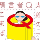
Обложка журнала.
Дизайн и иллюстрация «Щука»
Разговор с Иваном Величко на просторах ютуба.
#illustration #magcover
Дизайн и иллюстрация «Щука»
Разговор с Иваном Величко на просторах ютуба.
#illustration #magcover
❤15🔥3🥱1
❤5👍1
Olivetti объявляет о переходе с моноширинных знаков печатной машинки на пропорциональные. Согласно традиции буквы и знаки препинания размещались на площадке одного размера. У нас в Olivetti Editor теперь будет иначе: каждому знаку — своя собственная пропорциональная площадка.
#mono #typedesign #olivetti
#mono #typedesign #olivetti
🔥6
Letterform Archive tweeted these four amazing magazine advertisements by Paul Rand. They are all from a campaign he made for Westinghouse music-related electronic products in 1972.
🎯 ——>> wwwwww
#ad #typography #old_good_things
🎯 ——>> wwwwww
#ad #typography #old_good_things
❤🔥9