This media is not supported in your browser
VIEW IN TELEGRAM
How to Create a Heat Map Chart US or EU in Excel: Download:
https://exceltable.com/en/templates/how-to-create-a-heat-map-chart
Development of an interactive heat map of the USA and the European Union for data visualization in Excel. Download a ready-made dashboard template with figures of US states and EU countries. #Dashboard #msexcel #download #datavisualization
Media is too big
VIEW IN TELEGRAM
Excel Dashboard Template planet same day logistic Download.
Download example dashboard for a spectacular presentation of logistical indicators. Infographic animation elements are applied. Assembling beautiful diagrams.
https://exceltable.com/en/templates/dashboard-template-planet-sameday-logistics
Download example dashboard for a spectacular presentation of logistical indicators. Infographic animation elements are applied. Assembling beautiful diagrams.
https://exceltable.com/en/templates/dashboard-template-planet-sameday-logistics
This media is not supported in your browser
VIEW IN TELEGRAM
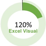
How to make Pie Chart more than 100 percent in Excel.
An interesting idea is how to create charts for indicators more than 100% or 200% and above. Step-by-step instructions with a file example of the finished result - download.
https://exceltable.com/en/templates/how-to-make-pie-chart-more-than-100-percent
An interesting idea is how to create charts for indicators more than 100% or 200% and above. Step-by-step instructions with a file example of the finished result - download.
https://exceltable.com/en/templates/how-to-make-pie-chart-more-than-100-percent
Диаграмма Ганта для визуализации потока данных онлайн: https://exceltable.com/ru/diagrammy-dannyh/diagramma-ganta-shablon/
Media is too big
VIEW IN TELEGRAM
В этом видеоуроке мы покажем вам пошаговый процесс создания диаграммы Ганта в MS Excel. Следуйте инструкциям, пока мы предоставим реальный пример и шаблон, которые сделают управление проектом простым! Узнайте, как эффективно визуализировать сроки и задачи проекта.
This media is not supported in your browser
VIEW IN TELEGRAM
Шаблон для презентации отчета о денежных потоках в Excel
This media is not supported in your browser
VIEW IN TELEGRAM
5 шаблонов дашбордов для бизнеса
This media is not supported in your browser
VIEW IN TELEGRAM
HR-дашборд в Excel для управления персоналом как в игре
This media is not supported in your browser
VIEW IN TELEGRAM
Лучший дизайн дашборда портфеля криптовалют в Excel Скачать шаблон в Excel: https://exceltable.com/shablony-skachat/luchshiy-dizayn-dashborda-portfelya-kriptovalyut
This media is not supported in your browser
VIEW IN TELEGRAM
Как использовать инструменты Excel для создания BI-дашборда. Скачать пример: https://exceltable.com/shablony-skachat/kak-ispolzovat-excel-dlya-sozdaniya-bi-dashborda
This media is not supported in your browser
VIEW IN TELEGRAM
Excel Charts for logistics comparison
Media is too big
VIEW IN TELEGRAM
How to Create 3D Graphics for Game in Excel Using Formulas
Media is too big
VIEW IN TELEGRAM
Excel Dashboard Cryptocurrency Portfolio Tracker