This media is not supported in your browser
VIEW IN TELEGRAM
Compare marketplace sales in Excel with a KPI-driven dashboard 🔹
Track performance, trends, ad efficiency, product groups, and weekday activity ➡️
Interactive and fully formula-based
Track performance, trends, ad efficiency, product groups, and weekday activity ➡️
Interactive and fully formula-based
👍6❤2🔥1
Media is too big
VIEW IN TELEGRAM
Track Agile progress with 🔻 Excel Funnel Backlog Levels Dashboard 🔹 Visualize Ideas. In Process & Done ➡️ Flow-focused, interactive, built with formulas only
👍5❤3
This media is not supported in your browser
VIEW IN TELEGRAM
Epic Burndown Chart in Excel for Agile Project Management 📉
Track sprint progress with a structured stacked bar chart: added tasks, tasks in progress, and completed work.
Track sprint progress with a structured stacked bar chart: added tasks, tasks in progress, and completed work.
🔥4👍1
🚀 Agile Sprint Cycle in Excel
Visualize your project as a planet with orbiting tasks 🌍 track sprints, story points, and workflow stages interactively. Make Agile management intuitive and presentation-ready.
https://exceltable.com/data-charts/interactive-sprint-circle-infographic-in-excel-dashboard
Visualize your project as a planet with orbiting tasks 🌍 track sprints, story points, and workflow stages interactively. Make Agile management intuitive and presentation-ready.
https://exceltable.com/data-charts/interactive-sprint-circle-infographic-in-excel-dashboard
Excel Table
Interactive Sprint Cycle infographic in Excel dashboard
Sprint Circle chart designed as a planet orbit infographic for project visualization. A clear example of visual design for Agile task and sprint management, available for download in Excel.
👍4❤2
This media is not supported in your browser
VIEW IN TELEGRAM
The Map Chart is the central element of a dashboard, designed to visualize logistics management metrics. Excel offers numerous ways to create a Map Chart. Here, we’ll explore a unique example that showcases innovative ways to display logistics routes on a map of the USA.
👍4🔥2❤1
This media is not supported in your browser
VIEW IN TELEGRAM
Niche or Mass Market? Margin or Volume? 📊
This Excel dashboard delivers real-time comparison of KPIs, ROI, market share, and sales dynamics across both segments
This Excel dashboard delivers real-time comparison of KPIs, ROI, market share, and sales dynamics across both segments
❤1👍1👌1
This media is not supported in your browser
VIEW IN TELEGRAM
Project Manager Roadmap in Excel Dashboard 📊 Track timelines, detect deviations, and keep delivery aligned with strategy sprint phases, workload distribution, and execution progress in one structured template.
👍1🔥1
This media is not supported in your browser
VIEW IN TELEGRAM
Visualize your investments like never before with Excel Fan Chart! 📈
Segment your portfolio, track asset allocation, and monitor growth in a Personal Finance Dashboard. Interactive, clear, and perfect for smarter financial decisions.
Segment your portfolio, track asset allocation, and monitor growth in a Personal Finance Dashboard. Interactive, clear, and perfect for smarter financial decisions.
👍4🔥1
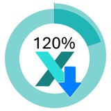
This media is not supported in your browser
VIEW IN TELEGRAM
🎯 Build stunning Donut Charts in Excel for interactive dashboards!
✅ Compact & stylish visualization
✅ Customizable & interactive
✅ Depth, gradients & functional design
Step-by-step Fast Build Video Tutorial
✅ Compact & stylish visualization
✅ Customizable & interactive
✅ Depth, gradients & functional design
Step-by-step Fast Build Video Tutorial
👍2🔥2