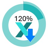
🚀 KPI Dashboard for Startup Project Management — in Excel
"What gets measured, gets managed."
Every startup bets on hypotheses. The brutal truth? Most of them don't survive first contact with real customers. The question isn't whether your assumptions will be challenged — it's whether you'll see it fast enough to pivot.
Our Excel KPI Dashboard was built exactly for that moment.
What it does:
📌 Tracks hypothesis validation in real time — plan vs. actual, side by side
📊 Turns raw startup metrics into a clear, visual performance snapshot
🎯 Keeps your team aligned on goals when everything else is moving fast
🔄 Reveals gaps between what you expected and what's actually happening — before it's too late
📁 No fancy software, no subscriptions — just Excel, working hard for your runway
Why it matters for startups:
Truth is revealed through comparison. This dashboard doesn't just show you numbers — it shows you the delta between your vision and reality. That delta is where decisions get made.
Whether you're tracking user acquisition, conversion rates, burn, or team output — every KPI tells a story. This template makes sure you're reading it.
📥 Grab the free template and start validating smarter.
https://exceltable.com/en/templates/kpi-dashboard-for-startup-project-management-in-excel
Excel Table
KPI Dashboard for Startup Project Management in Excel
The dashboard template helps support startup projects at the very beginning of their lifecycle. Businesses need support at the start of the journey. What should KPI plans look like to serve as an effective performance benchmark?
👍4❤1
📥 Download 🍔 Big Mac Index vs 🥣 Borscht Index Chart in Excel. Built a free interactive Excel infographic that combines both approaches:
🌍 Big Mac prices: USA, Germany, Hong Kong, Brazil
🥩 Ingredient breakdown: beef, cheese, buns, tomatoes, lettuce
🔄 Toggle: price per pound vs. share of burger cost
📅 Change period → every chart updates instantly
🌍 Big Mac prices: USA, Germany, Hong Kong, Brazil
🥩 Ingredient breakdown: beef, cheese, buns, tomatoes, lettuce
🔄 Toggle: price per pound vs. share of burger cost
📅 Change period → every chart updates instantly
👍2🔥2❤1
Media is too big
VIEW IN TELEGRAM
The cost reduction math is brutal in the best way:
Bakery margin = ~20%
Cut energy costs by 25% → profit literally doubles
Energy is one of the only expense categories in food production where that reduction is actually achievable.
But only if you know where to look.
Bakery margin = ~20%
Cut energy costs by 25% → profit literally doubles
Energy is one of the only expense categories in food production where that reduction is actually achievable.
But only if you know where to look.
👍2❤1🔥1
This media is not supported in your browser
VIEW IN TELEGRAM
What actually works in Excel:
→ Heat maps (spot patterns instantly)
→ Dashboards (all KPIs, one screen)
→ Interactive charts (filter with one click)
→ Donut charts (show share without words)
No Power BI. Just Excel.
→ Heat maps (spot patterns instantly)
→ Dashboards (all KPIs, one screen)
→ Interactive charts (filter with one click)
→ Donut charts (show share without words)
No Power BI. Just Excel.
❤5🔥2👍1
📥 Download Excel Portfolio Dashboard for Beginners. The dashboard has everything in one screen:
→ Asset allocation with live fill indicator
→ Interactive line chart (switch years & months on the chart itself)
→ Deposit / withdrawal cards
→ Fear Index, Dominance %, Liquidity % per period
→ Profitability estimator with missed profit calc
→ Day / Night mode toggle 🌙
→ Asset allocation with live fill indicator
→ Interactive line chart (switch years & months on the chart itself)
→ Deposit / withdrawal cards
→ Fear Index, Dominance %, Liquidity % per period
→ Profitability estimator with missed profit calc
→ Day / Night mode toggle 🌙
❤2👍2🔥2
Media is too big
VIEW IN TELEGRAM
100 Excel Dashboard Templates
🎨 3D infographics & metro-style layouts
📊 Sales & CRM visuals that close deals
💰 Financial reports that impress investors
📈 KPI boards for executive meetings
📣 Marketing decks built for impact
📥 Download
100 designs. All in Excel.
🎨 3D infographics & metro-style layouts
📊 Sales & CRM visuals that close deals
💰 Financial reports that impress investors
📈 KPI boards for executive meetings
📣 Marketing decks built for impact
📥 Download
100 designs. All in Excel.
👍2🔥2❤1
📊 100 Excel Dashboards 📥 Download
https://www.youtube.com/watch?v=ytMeMdQfFIQ
https://www.youtube.com/watch?v=ytMeMdQfFIQ
YouTube
100 Excel Dashboard Ideas for Business Reports
100 Advanced Excel Dashboards for Business Reporting
All Templates: https://exceltable.com/en/templates/
Video Chapters ⏱️ ▶️
0:00 Intro
0:05 1 - KPI Dashboard for Startup Project Management
0:13 2 - Excel Energy Dashboard for Bakery
0:20 3 - Excel Payroll…
All Templates: https://exceltable.com/en/templates/
Video Chapters ⏱️ ▶️
0:00 Intro
0:05 1 - KPI Dashboard for Startup Project Management
0:13 2 - Excel Energy Dashboard for Bakery
0:20 3 - Excel Payroll…
❤2👍2
Excel Visual pinned «📊 100 Excel Dashboards 📥 Download https://www.youtube.com/watch?v=ytMeMdQfFIQ»
Media is too big
VIEW IN TELEGRAM
3D Project Management Dashboard in Excel 🚀📊
🔹 Retail project performance tracking
🔹 Interactive 3D store visualization
🔹 Sales funnel & customer flow analysis
🔹 Revenue, profit, and conversion KPIs
🔹 HR workload & resource allocation
Built entirely in Excel using Pivot Tables, slicers, formulas, charts, and shapes — no VBA
🔹 Retail project performance tracking
🔹 Interactive 3D store visualization
🔹 Sales funnel & customer flow analysis
🔹 Revenue, profit, and conversion KPIs
🔹 HR workload & resource allocation
Built entirely in Excel using Pivot Tables, slicers, formulas, charts, and shapes — no VBA
👍4🔥2
🔔 Early access is one of the benefits of being a subscriber on this Channel. We invite you to watch our newly published video, Build a Project Viability KPI Dashboard in Excel, and be among the first viewers. The premiere has already begun: https://youtu.be/ZPSmqC4ugx0?si=TQv7CYfexc-2n-5E
YouTube
How to Build a KPI Project Viability Dashboard in Excel
Build a Project Viability KPI Dashboard in Excel — CAC, LTV, Cash Runway
Template: https://exceltable.com/en/templates/kpi-dashboard-for-startup-project-management-in-excel
In this step-by-step tutorial, you'll learn how to build a KPI Project Viability…
Template: https://exceltable.com/en/templates/kpi-dashboard-for-startup-project-management-in-excel
In this step-by-step tutorial, you'll learn how to build a KPI Project Viability…
👍4
This media is not supported in your browser
VIEW IN TELEGRAM
Top 3 Beautiful Pie Chart Designs in Excel
📊 Perfect for:
• KPI Dashboards
• Employee Performance Reports
• Executive Presentations
• Business Reviews
• Data Visualization Projects
Which chart design would you choose?
1️⃣ Modern Doughnut Chart
2️⃣ Interactive Pie Chart
3️⃣ Advanced Dashboard Chart
👇 Let me know in the comments.
📊 Perfect for:
• KPI Dashboards
• Employee Performance Reports
• Executive Presentations
• Business Reviews
• Data Visualization Projects
Which chart design would you choose?
1️⃣ Modern Doughnut Chart
2️⃣ Interactive Pie Chart
3️⃣ Advanced Dashboard Chart
👇 Let me know in the comments.
👍5❤2🔥2
This media is not supported in your browser
VIEW IN TELEGRAM
What a real Excel dashboard can look like:
✦ Tablet-style UI
✦ Rounded bar charts (horizontal + combined)
✦ Interactive cursor that highlights specific data
✦ Progress bars for instant KPI reads
✦ Auto-updating labels via formulas
✦ Navigation menu built from charts
Zero plugins. Zero VBA. Just Excel.
✦ Tablet-style UI
✦ Rounded bar charts (horizontal + combined)
✦ Interactive cursor that highlights specific data
✦ Progress bars for instant KPI reads
✦ Auto-updating labels via formulas
✦ Navigation menu built from charts
Zero plugins. Zero VBA. Just Excel.
👍2❤1🔥1
Media is too big
VIEW IN TELEGRAM
How to Make KPI Dashboard for Project Viability Manage in Excel
What's inside:
→ Interactive cash gap line chart with adjustable plan level
→ Butterfly chart for CAC split by audience
→ Radar chart: loyal customers vs. average order value
→ Global slicers — one click updates every screen
→ Light & dark mode — neumorphism design
→ Zero plugins. Pure Excel.
💡 A business survives not on promises of future LTV
🔥3👍2