This media is not supported in your browser
VIEW IN TELEGRAM
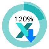
Planned vs Completed Tasks in Excel 📊 for Dashboard Control Panel
An interactive dashboard chart to monitor task allocation and team performance.
Analyze plan completion, manager workload, and key Agile metrics in one Excel control panel.
An interactive dashboard chart to monitor task allocation and team performance.
Analyze plan completion, manager workload, and key Agile metrics in one Excel control panel.
❤4👍2🔥1
This media is not supported in your browser
VIEW IN TELEGRAM
Excel charts shouldn't be boring. 📉
Custom Line Chart for Excel Dashboard
If your dashboard looks like a default preset, you're losing credibility.
Elevate your "New Customer" data with a Combo Chart:
✨ Gradient Fills for a SaaS look
🔥 Glow Effects on trend lines
⚡️ Slicers for live interactivity
Modernize your data. 📊
Custom Line Chart for Excel Dashboard
If your dashboard looks like a default preset, you're losing credibility.
Elevate your "New Customer" data with a Combo Chart:
✨ Gradient Fills for a SaaS look
🔥 Glow Effects on trend lines
⚡️ Slicers for live interactivity
Modernize your data. 📊
❤2👍1
This media is not supported in your browser
VIEW IN TELEGRAM
Speedometer Excel Chart for HR Dashboard Template 📊
Download 👉 Gauge Chart in Excel
Speedometer KPI Chart in Excel 📊
From a simple pie chart to a full dashboard element:
zones • gradients • dynamic value
Control with slicers and counters for real-time interaction.
Excel can do more than you think.
Download 👉 Gauge Chart in Excel
Speedometer KPI Chart in Excel 📊
From a simple pie chart to a full dashboard element:
zones • gradients • dynamic value
Control with slicers and counters for real-time interaction.
Excel can do more than you think.
❤1👍1
Media is too big
VIEW IN TELEGRAM
Why bother? 🛠
Because GETPIVOTDATA is structurally sound.
Interactive Charts of Dashboard from an Excel Pivot Table
Add a column? Move a row? Change the filter?
Your Charting Table (and your charts) will still find the data. No manual fixing required. It’s "set it and forget it" engineering. ✅
Because GETPIVOTDATA is structurally sound.
Interactive Charts of Dashboard from an Excel Pivot Table
Add a column? Move a row? Change the filter?
Your Charting Table (and your charts) will still find the data. No manual fixing required. It’s "set it and forget it" engineering. ✅
👍2❤1
This media is not supported in your browser
VIEW IN TELEGRAM
Take full control of your finances with an Excel dashboard designed for personal money management.
📥 Best Personal Finance Dashboard in Excel 🚀
Beautiful design 🎨 and Interactive features 👆. Track income, expenses, investments, and debt, visualize progress toward financial goals, and make smarter decisions - all in one interactive, easy-to-use template.
📥 Best Personal Finance Dashboard in Excel 🚀
Beautiful design 🎨 and Interactive features 👆. Track income, expenses, investments, and debt, visualize progress toward financial goals, and make smarter decisions - all in one interactive, easy-to-use template.
🔥4👍1
The Best Excel Dashboard for Personal Finance Management https://exceltable.com/en/templates/best-dashboard-for-personal-finance-management-in-excel
Excel Table
Best Dashboard for Personal Finance Management in Excel
Download the dashboard template for the most effective management of personal expenses and income in Excel. It also includes management of personal investments, debts, and financial goals.
👍1🔥1
Excel Visual pinned «The Best Excel Dashboard for Personal Finance Management https://exceltable.com/en/templates/best-dashboard-for-personal-finance-management-in-excel»
This media is not supported in your browser
VIEW IN TELEGRAM
Stop building static reports. Start building control centers. 🛠
Monthly Revenue Forecast Chart in CRM Excel Dashboard Template
I just finished an Excel Revenue Dashboard that turns raw data into a dynamic forecasting tool. The secret? A centralized Slicer block that defines the data context for the entire sheet.
What’s under the hood:
📊 Actuals: Bar chart for monthly revenue.
📈 Forecast: Line chart for planned sales.
🎯 KPI: Instant % of plan fulfillment.
One click to switch from Q2 analysis to a 3-year YOY comparison. Clean, fast, and effective.
👍3🤔1